

| TL;DR: SurveySparrow ranks for close to 2,500 non-branded keywords, but that traffic doesn’t come from one type of page. Survey-question templates bring in readers before they’re shopping for software, tool roundups bring in readers comparing options, and competitor comparison pages bring in readers who never searched for SurveySparrow at all. In this breakdown, we look at how these three kinds of content connect, and what any SaaS brand chasing similar visibility can take from it. |
Search for a customer satisfaction survey tool, a list of UX survey questions, or how one survey platform compares to another, and SurveySparrow tends to show up somewhere in the results. At its core, SurveySparrow is a survey and experience-management platform, so none of these searches sit far from what it actually sells.
The easy explanation of repeated appearance can be volume. SurveySparrow puts out a lot of content, and some of it is bound to rank.
When you look closer, though, it is not one type of content. You can see a category of articles, some being comparison pieces pitching SurveySparrow against tools like Typeform and Qualtrics. That’s just one category, and there are others too, which we won’t reveal yet. So what is working out in their favour?
To find out, we pulled SurveySparrow’s organic rankings and highest-traffic pages in Ahrefs, then reviewed how its content is structured across different searches.
This article breaks down what we found and what other SaaS brands can learn from it.
Survey Question Content Brings SurveySparrow Into the Search Early
When we analyzed Ahrefs top pages data, we found something truly surprising. Across the site, there are 48 ranking URLs, which are mostly blog pieces, that contain the word “questions” in them. These blogs alone bring in close to 2.1K monthly traffic. Most of these articles are built around specific survey and poll question searches.
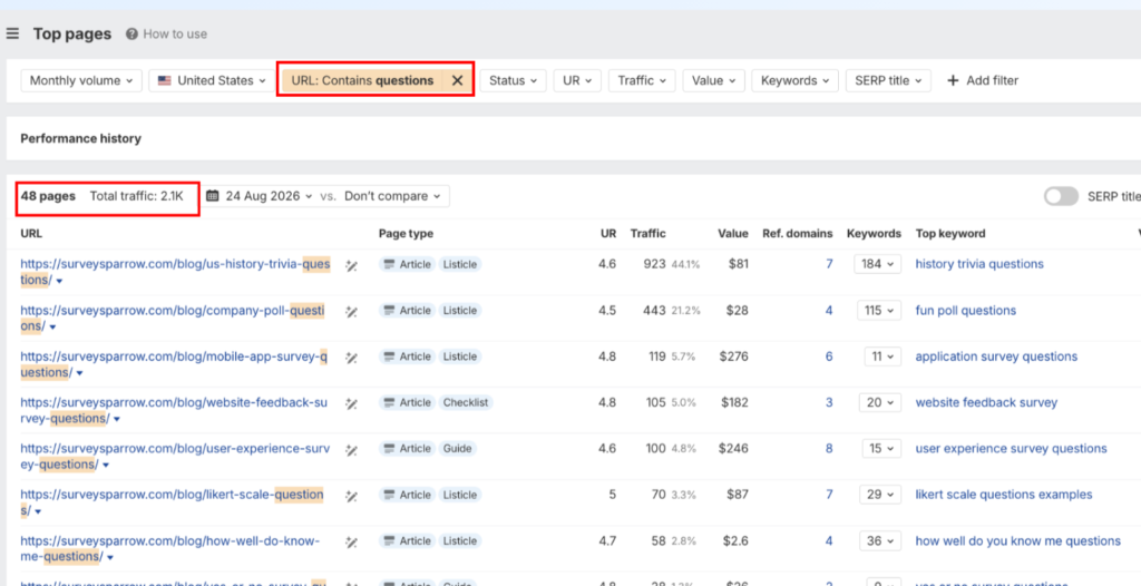
Source – Ahrefs
Someone looking for mobile app survey questions, website feedback survey questions, or a set of Likert scale examples is trying to finish a task, not choose a tool. SurveySparrow just happens to be where that task gets done.
The user experience survey questions page is a good example of how this plays out. It ranks in position 4 for “user experience survey questions” and pulls in roughly 200 estimated monthly US visits.
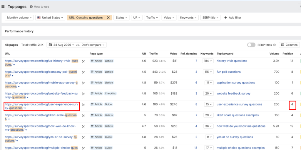
Source – Ahrefs
The article gives a reader exactly what they came for: a list of UX questions they can use to build a user experience survey. But it doesn’t stop there. The same page offers a free UX survey template too. It also lets the reader build the survey with AI, right on the spot. And there’s a straightforward path into a free trial.
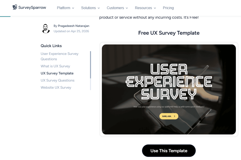
Source – SurveySparrow
It becomes clear pretty quickly that SurveySparrow isn’t just answering the search. It’s giving the reader a way to act on it without leaving the page.
This strategy works because task-focused content can easily stop at the answer. A reader gets their list of questions and moves on, with no reason to remember who provided it. By building the next step directly in, this gives SurveySparrow a chance to introduce the product during what would otherwise be a purely informational visit.
This page isn’t sitting alone on the site, either. Ahrefs shows nine internal links pointing to it, including links from SurveySparrow’s UX template, survey findings, population-of-interest, course evaluation, and customer experience content. That doesn’t prove internal linking caused the ranking, but it does show SurveySparrow connecting related informational pages rather than leaving this article isolated. Here’s what that link profile looks like in Ahrefs:
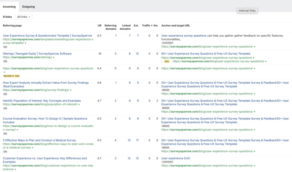
Source – Ahrefs
Tool Roundups Help SurveySparrow Show Up When Buyers Start Comparing
A reader looking for survey questions is surfing and probably not ready to buy anything yet. However, later in the buying journey, the search changes from how do I do this to which software should I use. SurveySparrow has content built for that shift too.
The clearest example is its listicle on customer satisfaction survey tools. Over the past six months, this one article gained nearly 500 estimated monthly visits, and its position for “csat survey software” (customer satisfaction survey software) climbed 17 spots to position 4. This isn’t an old ranking SurveySparrow is holding onto. It’s actively gaining ground right now.
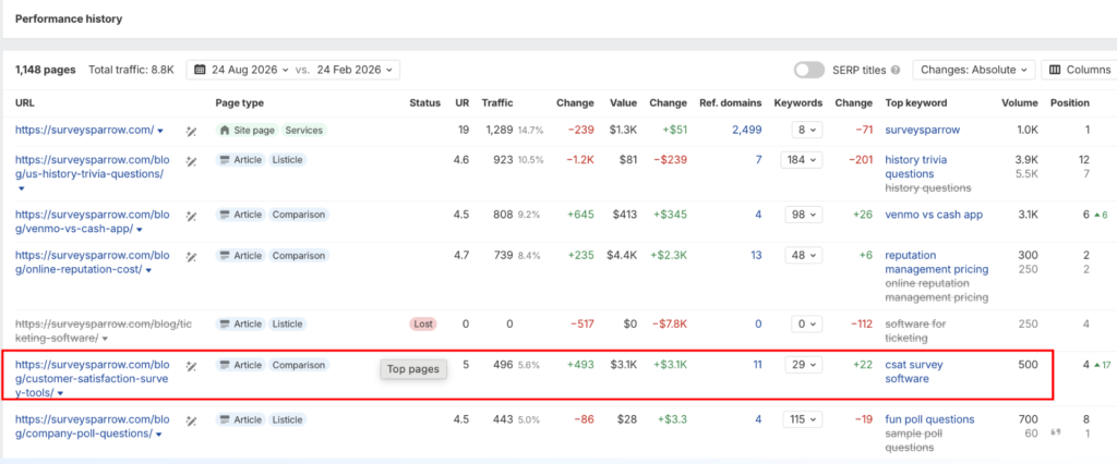
Source – Ahrefs
SurveySparrow does put its own product first, but it doesn’t simply declare it the best overall. Instead, each product gets a specific “best for” label. SurveySparrow gets positioned for conversational surveys and omnichannel feedback. Typeform and Jotform each get their own use case instead of a generic pitch. You can also read how these companies are winning the SEO game in our analysis here: Jotform Visibility analysis and Typeform Visibility analysis.
Putting itself first is obviously self-interested and a strategy commonly followed by most companies. But the label makes that recommendation easier to evaluate: a reader can check “best for conversational surveys and omnichannel feedback” against their own situation and decide for themselves if it fits, rather than just being told to trust a #1 ranking. SurveySparrow’s own section, positioned first among the eleven, backs that up with product screenshots, pricing, and a trial link.
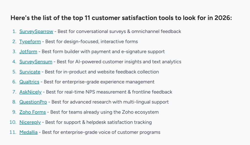
Source – SurveySparrow
Competitor Comparisons Put SurveySparrow Into Searches That Never Mention It
Not every comparison piece SurveySparrow ranks for includes SurveySparrow in the search itself.
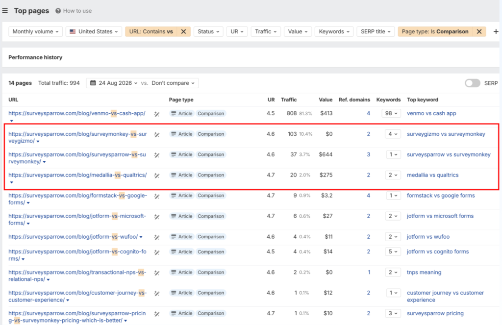
Its comparison pages rank for a mix of terms; some include SurveySparrow directly, like SurveySparrow vs SurveyMonkey, which sits at position 2. Others don’t mention SurveySparrow at all, like SurveyMonkey vs SurveyGizmo, also at position 2. The second kind is more strategically interesting. It puts SurveySparrow in front of a buyer before SurveySparrow is even on their shortlist, as the article finishes with how SurveySparrow is a better alternative to both tools.
Source – Ahrefs
The SurveyMonkey vs SurveyGizmo ranking shows SurveySparrow can capture a search that never mentions its name.
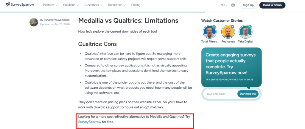
The Medallia vs Qualtrics comparison, on the other hand, shows another strategy at play. For almost the whole piece, the comparison copy stays focused on Medallia and Qualtrics. It walks through what Qualtrics does well, what Medallia does well, and where each one comes up short, without mentioning SurveySparrow once. The neutral tone breaks right after Qualtrics’s limitations are listed, before Medallia’s downsides even appear: “Looking for a more cost-effective alternative to Medallia and Qualtrics? Try SurveySparrow for free.” That’s it. No forced comparison. Just a quick CTA in case you are looking for a cost-effective option.
Source – SurveySparrow
The placement is strategically useful. The CTA appears right after the section on Qualtrics’s limitations, before Medallia’s downsides are even listed, the exact moment SurveySparrow positions itself as an alternative. By the end of the article, the reader is also pointed toward a list of Medallia and Qualtrics alternatives. That gives SurveySparrow a second chance to be considered, even if the earlier CTA didn’t land.
The first two strategies meet readers somewhere along the path from solving a survey-related problem to actively comparing software. This one goes further: it gets SurveySparrow into a search where nobody asked for it. Whether this kind of layered content also helps SurveySparrow show up in ChatGPT, Gemini, or Perplexity answers is worth testing next. If you’re curious how that kind of tracking actually works, we’ve broken it down separately in how to measure AI search visibility, so you can test it yourself.
How SurveySparrow Builds Visibility Across Different Search Stages(And How You Can Do It Too)
What connects these pages isn’t their format. It’s the range of search intent they cover. SurveySparrow has content for the task someone is trying to complete, the category they eventually start evaluating, and even the competitor comparison they make before SurveySparrow enters their shortlist.
That’s a more useful way to think about search visibility than simply counting published articles, and it’s also harder to copy, since it means understanding your buyer’s actual path, not just producing more pages. Close to 2,500 non-branded keywords sounds like the headline number, but the real story is where those keywords sit across a buyer’s search, not just how many of them there are.
For any SaaS brand trying to build the same kind of visibility, the takeaway isn’t to copy SurveySparrow’s exact pages. It’s to map out where your own buyers actually get stuck: before they know what to ask, while they’re comparing tools, and while they’re reading about someone else’s product. Then build content for that whole sequence, instead of betting on one type of page.
At Concurate, this is the kind of pattern we look for in any SaaS brand’s search visibility: not how much they’ve published, but whether it lines up with how buyers actually search. If you want to see how your own site maps against that same path, that’s exactly what our content strategy work is built around. Book our calendar and our team can walk you through how we can achieve visibility for your company.
Disclaimer: This article is based on publicly available information from SurveySparrow’s website, Ahrefs data, and other third-party platforms. The evaluation reflects our independent analysis, and we recommend checking SurveySparrow’s website or speaking with their team for the latest details on features, pricing, and results.