| TL;DR: Power BI, Tableau, and Qlik are some of the most visible names in business intelligence. But even these established platforms are losing rankings for high-intent BI and analytics searches. We analyzed Ahrefs data and found 39 keywords where all three lost rankings, including searches around BI software, cloud BI tools, reporting software, embedded analytics, and sales analytics. For challenger BI brands, this creates an opening. By building best-of lists, comparison pages, alternative content, case studies, and AI-friendly pages, they can show up when buyers are already evaluating tools across Google and AI surfaces. |
If you search for top business intelligence platforms on Google or ask AI engines for BI tool recommendations, chances are, seven times out of ten, the same three names will show up: Power BI, Tableau, and Qlik.
These tools are popular, widely adopted, and have years of search visibility behind them. Even though there are dozens of platforms that now offer business intelligence, analytics, reporting, and dashboarding capabilities, these are still the names buyers usually see first.
However, even these established platforms are not protected from ranking drops.
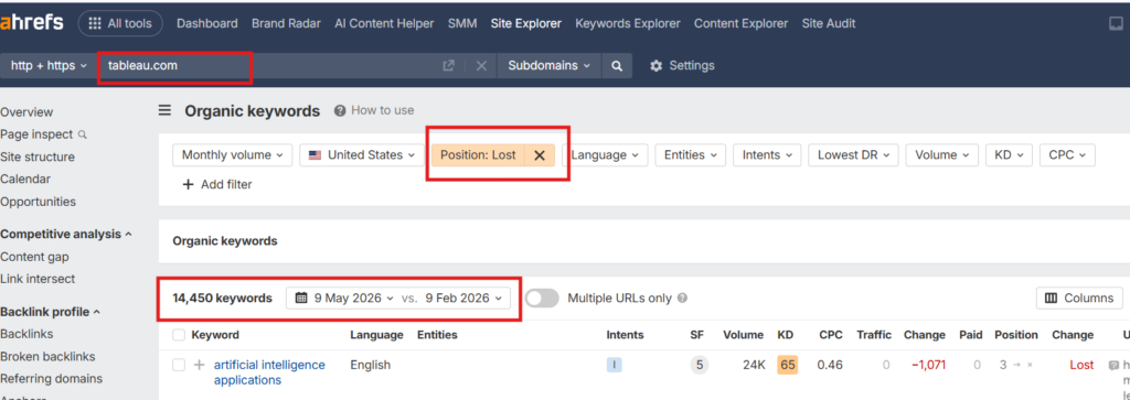
When we checked Ahrefs, Tableau alone had lost rankings for around 14,450 keywords in the last three months, out of which 1495 were high intent. That made us curious.
Surely Tableau couldn’t be alone. So we looked at Power BI and Qlik to see what kind of high-intent BI and analytics keywords they were losing rankings for.
The reason was simple. Ranking drops from larger platforms can create openings for challenger brands. If you know which keywords they are slipping on, you can build better, more focused content around those searches and show up when buyers are already looking for solutions.
In this article, we will break down the keywords these three platforms lost rankings for, and how you can leverage this window of opportunity.
How We Found These 39 High-Intent BI and Analytics Keywords
To build this analysis, we started with Ahrefs organic keyword data. Since the raw list included thousands of lost keywords, we narrowed it down to searches connected to business intelligence, analytics, reporting, dashboards, and related buying intent.
So, to narrow the keyword list, we first had to define the space properly. We started by looking for credible explanations of what business intelligence includes.
Investopedia defines business intelligence as “a technology-driven process that turns business data into actionable insights.”
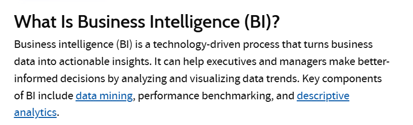
Source – Investopedia
That meant we could not look only at keywords that literally included “business intelligence.” The BI category also includes searches around analytics, reporting, dashboards, visualization, and pricing.
So, we used Ahrefs to look at the organic keywords these three platforms had lost rankings for in the last three months. To keep the dataset focused, we applied three filters:
- Intent: Commercial and transactional
- Position change: Lost
- Keyword filter: business intelligence, BI, analytics, reporting, dashboard, visualization
This helped us remove most informational searches and focus on keywords that showed clearer buying or evaluation intent.
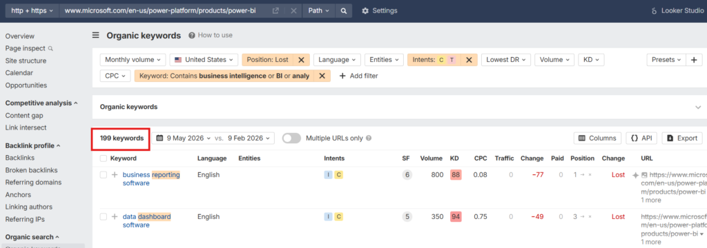
After applying these filters, we found that Tableau had lost rankings for 322 keywords.
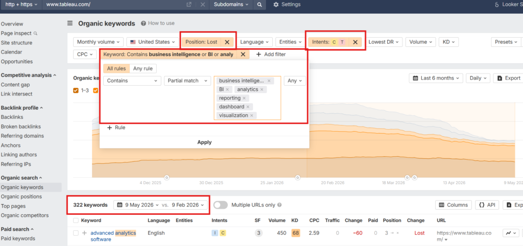
Power BI for 199 keywords, and Qlik for 262 keywords.
We recently studied why some BI platforms appear more in AI search recommendations than others. Read our insightful findings here.
Which High-Intent BI and Analytics Keywords These Platforms Lost Rankings For
From there, we compared all three keyword lists to find exact overlaps.
You see, we did not just want to know what Tableau, Power BI, and Qlik were losing rankings for individually. We wanted to see if there were any common keywords where all three platforms had slipped.
Searching for that overlap gave us 39 high-intent BI and analytics keywords where Power BI, Tableau, and Qlik had all lost rankings.
Here’s the full list:
| Keyword | US Volume | Keyword Difficulty |
| advanced analytics services | 700 | 5 |
| ai reporting tools | 250 | 48 |
| automated reporting software | 200 | 8 |
| automation reporting tool | 90 | 8 |
| best analytics software | 400 | 80 |
| best bi software | 150 | 46 |
| best business intelligence tools | 400 | 59 |
| best data analytics tools | 200 | 83 |
| best retail analytics software | 150 | 5 |
| big data analytics tool | 100 | 11 |
| business analytics services provider | 150 | 59 |
| business intelligence & analytics services | 150 | 4 |
| business intelligence and data analytics services | 350 | 4 |
| business intelligence development services | 300 | 4 |
| client dashboard software | 300 | 40 |
| client reporting solution | 70 | 2 |
| client reporting tool | 200 | 3 |
| client reporting tools | 250 | 2 |
| cloud bi tools | 300 | 46 |
| cloud business intelligence tools | 350 | 84 |
| conversational analytics software | 250 | 3 |
| dashboard reporting software | 250 | 88 |
| data visualization consultants | 150 | 2 |
| embedded analytics software | 150 | 22 |
| financial reporting and analysis software | 200 | 20 |
| marketing reporting tool | 300 | 78 |
| marketing reporting tools | 400 | 9 |
| pricing analytics software | 350 | 6 |
| product analytics software | 450 | 79 |
| product visualization services | 150 | 3 |
| product visualization software | 90 | 39 |
| sales analytics software | 1,100 | 20 |
| sales analytics tools | 1,300 | 20 |
| sales reporting tool | 100 | 25 |
| self-service analytics tools | 300 | 5 |
| top business intelligence software | 70 | 23 |
| visualization services | 150 | 26 |
| web analytics platform | 100 | 94 |
| website analytics services | 300 | 95 |
What makes this list interesting is that some of these are direct category keywords, such as best BI software, best business intelligence tools, cloud BI tools, and top business intelligence software. These are the kinds of queries buyers use when they are actively exploring options.
Then there are reporting and dashboard-led keywords such as dashboard reporting software, automated reporting software, client reporting tools, and sales reporting tool. These are the kinds of keywords buyers search for when they are actively exploring specific features or use cases inside BI tools.
The list also includes newer BI-related categories, such as conversational analytics software, AI reporting tools, embedded analytics software, and self-service analytics tools. These are especially important because they reflect where the BI market is headed: toward easier, faster, and more embedded ways of accessing business data.
So the opportunity for challenger BI and analytics brands is clear.
They can create sharper content around the queries where buyers already show clear intent. Next, we will look at how you can use this window of opportunity to gain visibility faster across search engines and AI surfaces.
3 Strategies That Can Help BI and Analytics Brands Win These Keywords
At Concurate, we feel there are some clear patterns behind how BI and analytics companies can win high-intent searches.
The good news is that these opportunities are not limited to large platforms like Power BI, Tableau, and Qlik. But ranking for these keywords is not about writing one giant article on “best BI tools” and hoping it works.
BI buyers search in many different ways. Some look for newer categories like AI reporting or embedded analytics. Others compare popular platforms before making a decision. Whereas a few search by department, use case, or reporting need.
So if you want to win these searches, your content strategy needs to match how buyers actually search. Here are three strategies that can help.
1. Create Best-of Lists Around the BI Categories You Want to Be Found For
One of the easiest ways to show up for high-intent BI searches is to create best-of listicles around the exact categories your buyers are exploring. Your buyers are not directly asking, “Which are the top Business intelligence tools?”
They are searching for:
- Best cloud business intelligence tools
- Best embedded analytics tools
- Best self-service analytics tools
- Best AI reporting tools
- Best sales analytics software
Buyers have a much clearer intent in their mind than you think. For example, in Ahrefs, the keyword cloud business intelligence tools has a US search volume of 300.
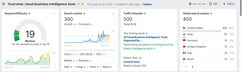
Source – Ahrefs
Now, if your BI platform is cloud-native or has strong cloud-based reporting and analytics capabilities, you can create a listicle around top cloud business intelligence tools.
In that article, you can feature your tool at the top, followed by other popular platforms. But the content should not just be a random list of tool names. It should help the buyer compare options clearly. You can sort them by deployment options, reporting capabilities, embedded analytics support, AI features and more.
This kind of content also helps with AI visibility.
For instance, when we asked Perplexity to list top cloud-based business intelligence tools, Domo appeared in the answer. One likely reason is that Domo has created list-style content around the best business intelligence tools, which gives AI engines like ChatGPT structured information to pull from.
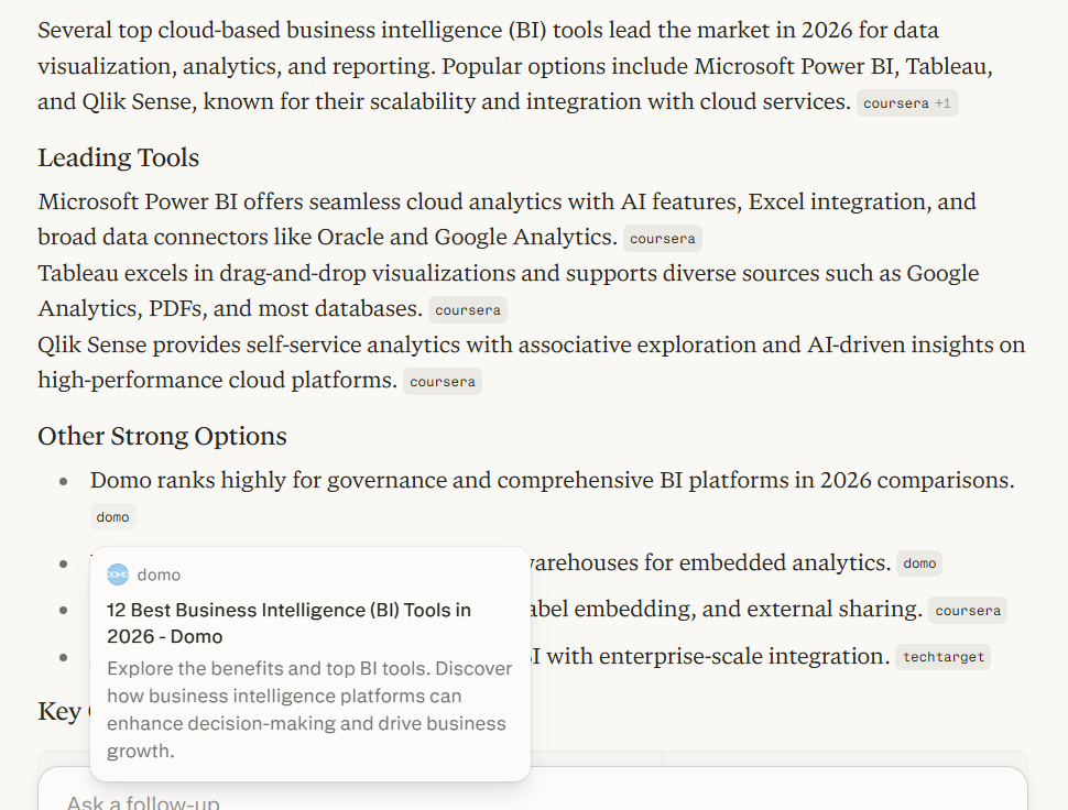
Source – Perplexity
The lesson is clear. If you want AI tools and search engines to understand where your BI platform fits, you need to create content that clearly places your tool inside the right category.
Do not just chase broad terms like “best BI tools.” Go after the specific searches where your product has a real chance to stand out. That is how a challenger BI brand can enter the buyer’s consideration set faster, even in a market dominated by names like Power BI, Tableau, and Qlik.
2. Create Comparison and Alternative Pages Around Popular BI Platforms
When buyers explore BI and analytics tools, they rarely look at one platform in isolation. They already know names like Power BI, Tableau, Qlik, Looker, and ThoughtSpot. These platforms have strong brand recall, which means buyers often use them as reference points before evaluating any newer or lesser-known tool.
So when someone discovers your BI platform, one of the first questions in their mind is: How does this compare with the popular tools I already know?
That is where comparison and alternative pages can help.
If your tool is easier to use, more affordable, better suited for embedded analytics, stronger for a certain industry, or more flexible for a specific use case, comparison content gives you a direct way to show that.
For example, Tableau has a dedicated page comparing Tableau with Power BI.
The page does not just say Tableau is better. It compares both platforms across areas like deployment flexibility, governance, AI-powered insights, drag-and-drop usability, Mac support, workflow integrations, and Salesforce integration. It also includes customer-reported outcomes, such as higher insights-driven decision-making and improved business user productivity.
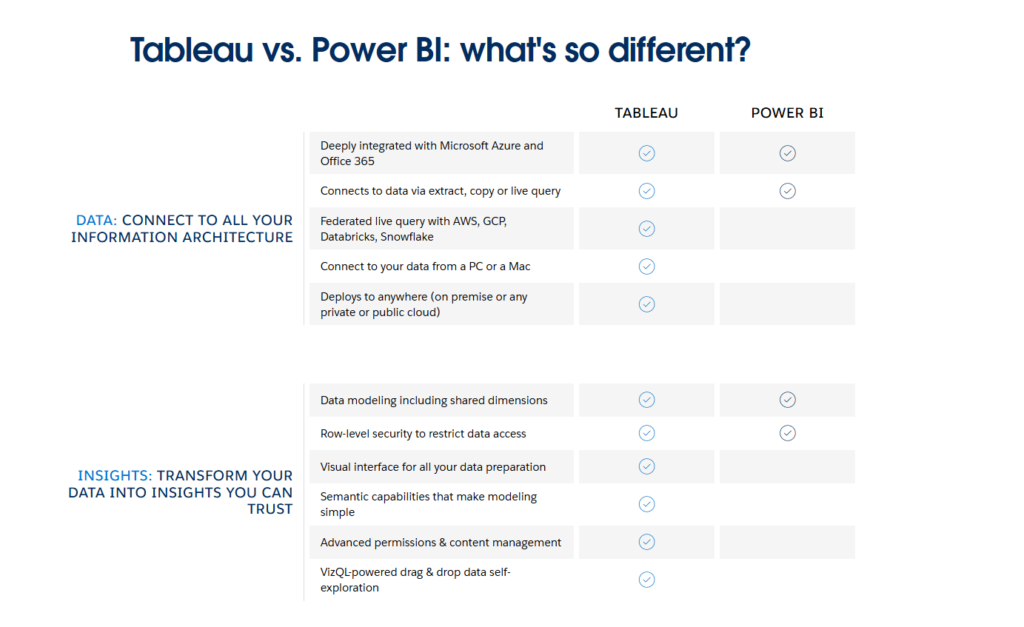
Source – Tableau
Qlik does something similar too. It has a compare page where it shares how it compares against Power BI and Tableau. From what we checked, Qlik keeps its comparison focus on these two competitors, and that makes sense. Qlik clearly knows which platforms its buyers are most likely comparing it against and creates content for those searches.
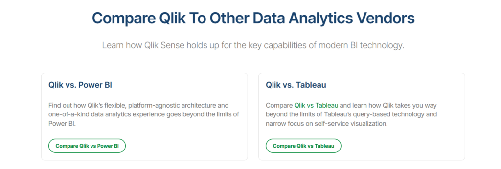
Source – Qlik
Recommended Read: Qlik Marketing Strategy Playbook: How They Rank for 63K Keywords & Own BOFU Intent
But for your BI brand, the comparison set should be wider. You can create pages or blog posts around topics like:
- Your tool vs ThoughtSpot
- Your tool vs Tableau
- Your tool vs Qlik
- Your tool vs Looker
- Best Tableau alternatives
- Best Power BI alternatives
And more.
The goal is not to attack the popular tools. The goal is to help buyers understand where your platform fits better.
Maybe your tool is better for SaaS companies that need embedded dashboards. Maybe it gives agencies better client reporting. Or maybe it is more useful for finance teams that need automated reporting.
Whatever your strength is, comparison content helps you explain it clearly.
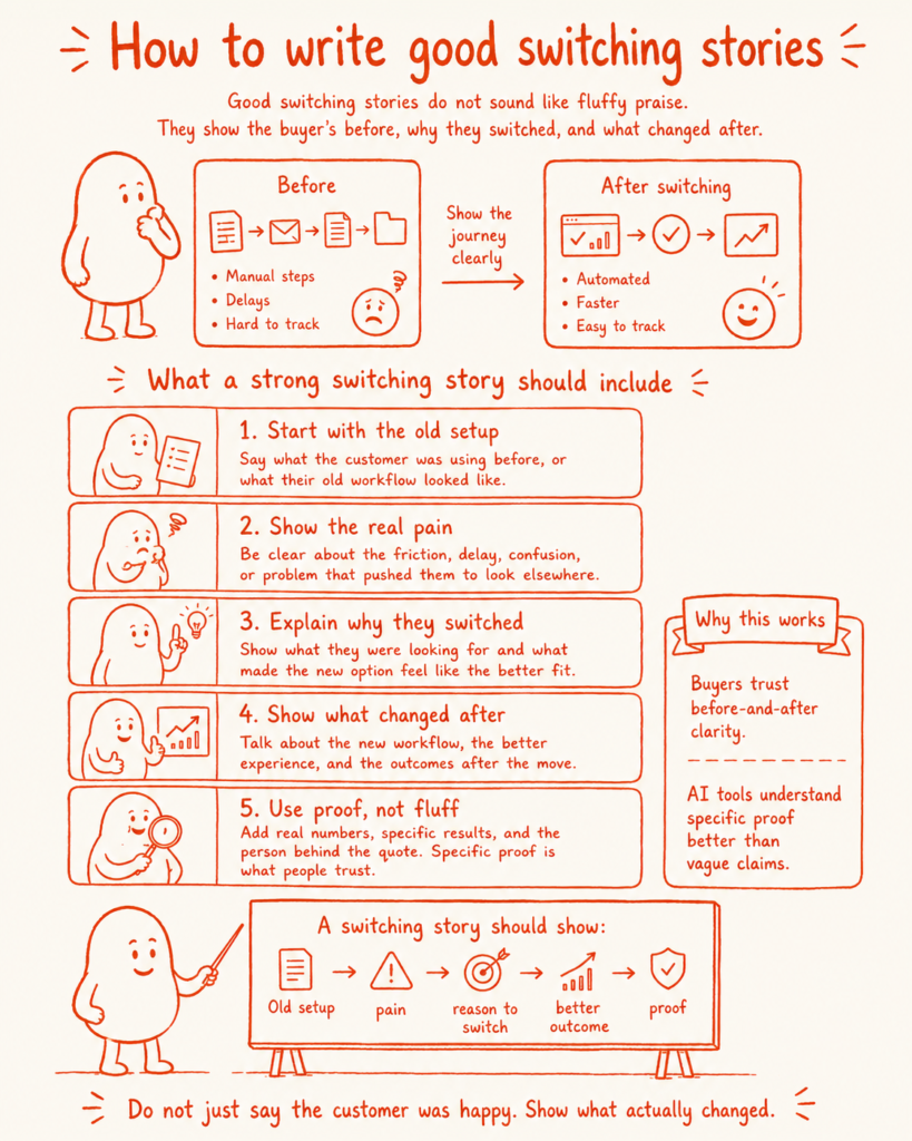
3. Write Case Studies and Switching Stories That Show Why Buyers Move
In the BI market, many buyers are not buying a tool for the first time. They may already be using Power BI, Tableau, Qlik, Looker, spreadsheets, or internal dashboards. So when they look for another platform, they are not just asking, “Which BI tool is good?”
They are asking: Why should we move from what we already use?
That is where case studies and switching stories help.
A good switching story shows what the customer was using before, what was not working, why they moved, and what changed after the switch.
For example, Tableau has a resource on the hidden costs of Power BI. It talks about how Power BI may look free at first, but can come with hidden costs around migration, training, governance, compute, and scaling.
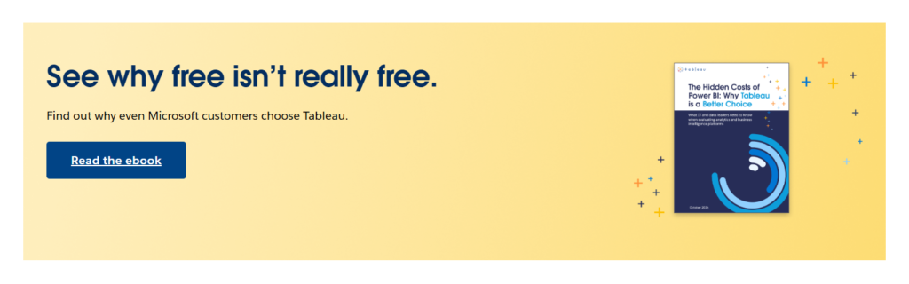
Source – Tableau
That is the kind of angle BI brands can learn from.
Do not just write case studies that say: “Customer X improved reporting with our platform.”
Show the actual before-and-after. The stronger the proof, the better.
Use numbers, screenshots, customer quotes, workflow examples, feature comparisons, and clear outcomes. Show how much time was saved, how many reports were automated, how dashboard adoption improved, or how decision-making became faster.
You can also add these stories to your comparison and alternative pages.
For example, if you create a Your Tool vs Power BI page, include a short story showing why a customer moved from Power BI to your tool.
That way, your content does more than rank. It gives buyers a real reason to believe your business intelligence platform is worth considering.
There Are Few More Ways to Improve Visibility Across Search Engines and AI Surfaces
The three strategies above are a strong starting point. But winning high-intent BI and analytics keywords is not just about creating new content. It is also about making your existing content easier to find, understand, and trust.
Here are a few more things BI brands can do:
- Update old content with fresh data: AI surfaces trust content that feels current. If you already have blogs on BI tools, analytics platforms, dashboard software, or reporting tools, refresh them with new stats, updated product details, recent screenshots, and current examples.
- Strengthen internal linking: Do not let your comparison pages, listicles, and case studies sit in isolation. Link them together so search engines can understand the relationship between your pages. For example, your “best embedded analytics tools” article should link to your embedded analytics product page, relevant case studies, and comparison pages.
- Make your content easier for AI tools to parse: Use clear headings, comparison tables, feature breakdowns, FAQs, and short answer-style sections. AI engines need structured information they can understand quickly. A long, vague article without clear formatting is much harder to pull into an answer.
- Add proof wherever possible: Screenshots, customer quotes, before-and-after results, and specific numbers make your content more credible. This is especially important in business intelligence, where buyers want proof that your tool can actually improve reporting or decision-making.
- Build around buyer questions, not just keywords: Keywords matter, but the real opportunity is in answering the questions behind them. A buyer searching for “best dashboard reporting software” may want to know which tool is easier to use, which one supports client reporting, which one integrates with their stack, and which one fits their budget.
The core idea is simple. If your content clearly explains where your BI platform fits, how it compares, who it is best for, and why buyers should trust it, you have a much better chance of showing up across both Google and AI surfaces.
But doing this consistently needs more than a few isolated blogs. It needs a focused content strategy, clear buyer understanding, and strong execution across search and AI visibility. That is where Concurate can help.
How Concurate Helps BI Brands Win High-Intent Searches
Every business intelligence brand wants to show up when buyers are actively searching for options, evaluating alternatives, or looking for the right platform for a specific use case.
At Concurate, we help you build that visibility around real buyer searches, so your brand appears at the right moment.
That could mean creating best-of lists, comparison pages, alternative content, case studies, and more. Each piece is designed to be AI-friendly by nature, so it does not just rank on search engines, but also has a better chance of appearing across AI surfaces like ChatGPT, Perplexity, Claude, and Gemini.
You see, our goal is not to bring traffic. It is to create content that brings leads and supports revenue.
If you want your BI platform to show up when buyers are looking for options, book our calendar today.
Frequently Asked Questions
1. Can smaller BI platforms compete with Power BI, Tableau, and Qlik in search results?
Yes, but not by chasing every broad keyword. Smaller BI platforms can compete by targeting sharper searches like “best embedded analytics tools,” “client dashboard software,” or “Power BI alternatives.” These keywords usually show clearer buyer intent. If your content answers those searches better than larger brands, you can still enter the buyer’s consideration set.
2. What type of content helps BI tools appear in AI recommendations?
AI engines usually prefer clear, structured, comparison-friendly content. For BI brands, this can include best-of lists, alternative pages, comparison pages, case studies, feature breakdowns, pricing explainers, and use-case pages. The goal is to make it easy for AI tools to understand what your platform does, who it is for, and where it fits in the market.
3. Do AI engines refer to list style articles to recommend platforms?
From what we have seen, they do often pull from list-style and comparison content when answering tool recommendation queries. If your article clearly explains the category, compares tools, and includes your platform with strong context, it gives AI engines more structured information to work with.
4. How can case studies help BI companies rank and convert better?
Case studies add proof. They show what the customer used before, what problem they faced, why they switched, and what changed after using your BI platform. This helps buyers trust your claims. It also gives search engines and AI tools stronger context around your product’s use cases, outcomes, and real-world value.
5. What makes a Business intelligence tool page easier for AI engines to understand?
A BI tool page becomes easier to understand when it is clear, structured, and specific. Use direct headings, comparison tables, feature lists, use-case sections, FAQs, screenshots, customer proof, and simple explanations. Avoid vague claims. Explain who the tool is for, what problems it solves, and how it compares with other platforms.
Disclaimer: The information presented in this article is compiled from publicly available sources, including company websites, industry reports, and social media. All trademarks, brand names, and logos mentioned are the property of their respective owners. We do not claim any ownership of third-party marks, nor do we imply endorsement or affiliation. This article is intended for informational purposes only.