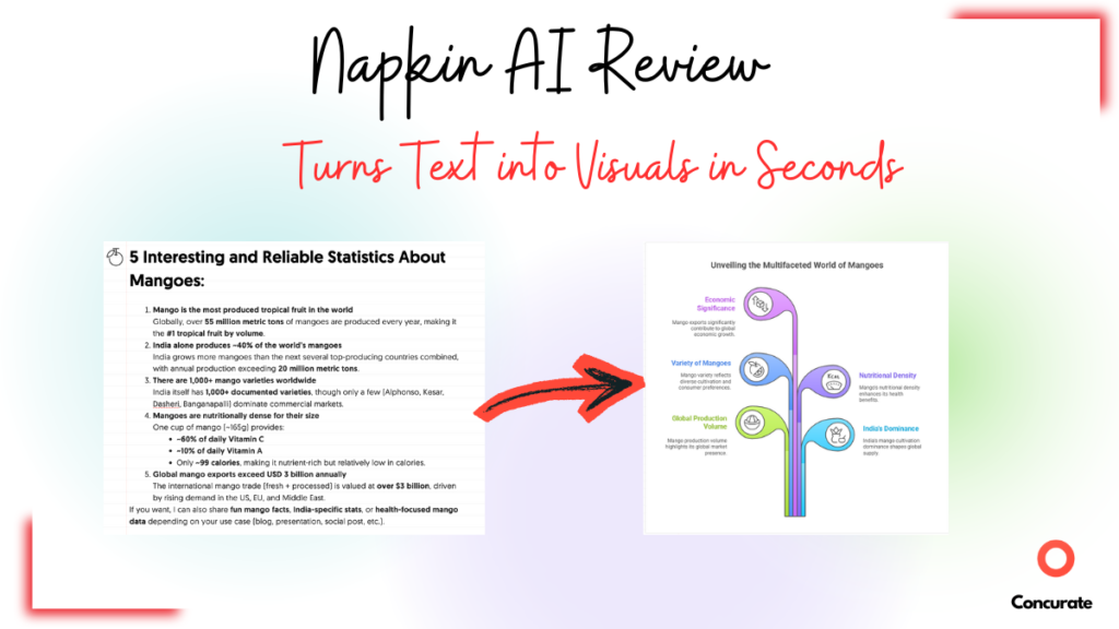
| TL;DR: This Napkin AI review is based on 8 months of real use testing Napkin AI as an AI infographic generator and text-to-visual tool. I cover what Napkin AI is (and isn’t), signup and first impressions, core features like text-to-graphic generation, AI diagram creation, and AI visuals generation, export options, and library management. The review also breaks down real limitations, free vs paid pricing, pros and cons, best-fit use cases, and an honest comparison with other AI diagram generators like Miro AI and Venngage AI. Final verdict explains whether Napkin AI is worth paying for, who should use it, and when alternative AI visualization tools are a better choice. |
I love adding visuals to my articles. Not for aesthetics, but because they help readers retain information longer.
The problem? Creating them used to eat up soooo much of my time.
I’d open Canva (this was before Canva AI came into the picture) and manually build each graphic. And twenty to thirty minutes later, I would finally have one graphic.
This made me think, “There had to be a better way.”
This is when I found Napkin AI, an AI infographic and diagram generator.
I tried it and started using it extensively. Even shared it with my team.
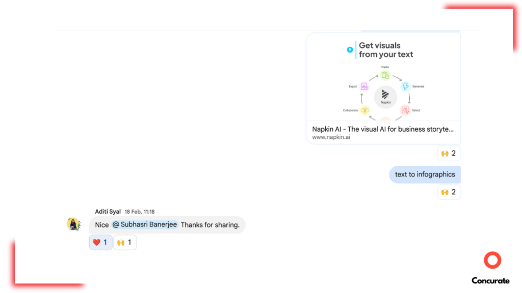
Eight months later, it’s still my go-to tool.
But Napkin AI isn’t perfect. There are frustrations. Real limitations. And if you’re considering paying for it, you need to know what you’re actually getting.
In this Napkin AI review, I’m sharing how Napkin AI performs, what it does insanely well, where it falls short, and whether it’s worth your money.
If you need visuals fast for content, this review is for you.
Why I Reviewed Napkin AI (And Who This Review Is For)
Here’s the reality of content creation in 2025.
If your article doesn’t have visuals, it’s already behind.
Visuals aren’t just about making things look pretty. They make your content more valuable. From an SEO perspective, articles with relevant images and diagrams rank better. From a reader’s perspective, they stay longer and retain more. No content writer or CMO can afford to skip visuals anymore.
While I say that, I will also agree that most of us (including me) aren’t designers. I have no formal design training (unless you count my years of drawing in MS Paint as a design education).
Before AI tools like Napkin AI came around, people like me were stuck spending hours in Canva or begging designers for help.
AI has changed that. It’s made visual creation accessible to non-designers, and honestly, that’s a game-changer for content teams. That’s why I wanted to test Napkin AI properly.
So here’s what I did. I used Napkin AI for 8 months. The free version, to be clear. I tested it across different content types. Blog posts for clients. YouTube thumbnails and graphics. LinkedIn carousels. Internal documentation. Flowcharts for complex processes. Pretty much anywhere I needed a visual, I threw Napkin AI at it.
I tested two core scenarios in this Napkin AI review. First, the text-to-graphic feature, where you paste content and Napkin generates visuals. Second, the AI drafting feature, where Napkin helps you write and then converts sections into graphics.
And I documented everything. What worked. What didn’t? How fast it actually was. Whether the free version was enough or if you really need to pay.
Note: This Napkin AI review is written from a content marketer’s perspective, focused on evaluating AI tools that convert text into visuals, diagrams, and infographics at speed.
What Is Napkin AI, Exactly? (And What It Is NOT)
Before we talk about features, let’s clear something up.
Napkin AI is not trying to be everything. It’s not a BI tool. It’s not Figma. And it’s definitely not a place to build dashboards or track live metrics.
Napkin AI does one thing. And it does that one thing really well.
It helps you convert your texts into visuals. You paste your content, pick a visual style, and it generates diagrams, flowcharts, frameworks, timelines, mind maps, and infographics. That’s it. That’s the core function.
If you need analytics dashboards, you’re looking at the wrong tool.
Napkin AI is also not a full design suite like Figma or Adobe Illustrator. You can’t do pixel-perfect brand design, complex illustrations, or detailed collaborative design work. The customization is limited compared to professional design tools.
Think of Napkin AI as the middle ground between typing text and hiring a designer. It’s for people who need good-enough visuals quickly, not people who need publication-ready custom design.
Now that we’ve set expectations, let me show you what actually happens when you use it.
Signup and First Impressions (A 2-Minute Setup Test)
I genuinely thought the visuals of Napkin AI wouldn’t be accurate until I actually tried it.
The signup process is almost boring. And I mean it in a good way.
You enter your email ID. And that’s it. No long onboarding flow. No unnecessary questions. You’re inside the product in under two minutes. I didn’t have to “set things up” or configure anything before getting started, which already put Napkin AI in the promising category for me.
But if you ask me about my first impression? I was definitely skeptical. I remember thinking, “This might not be as accurate as I am expecting it to be.” Turning raw text into clean visuals sounds great on paper. In reality, most AI tools either oversimplify things or miss context completely. So I wasn’t expecting much.
Then I pasted in a small paragraph I wrote. And that’s when my opinion changed.
The visuals were pretty accurate. The structure was logical. And more importantly, the output was usable without heavy fixing.
That first test was enough for me to keep using the tool. And once I started pushing more complex text through it, I realized this wasn’t just a one-off good result. Napkin AI was actually a pretty sick design tool.
Napkin AI Core Features I Tested (Detailed Explanation + Proof)
I’m not going to list every feature Napkin AI claims to have. That’s what their website is for.
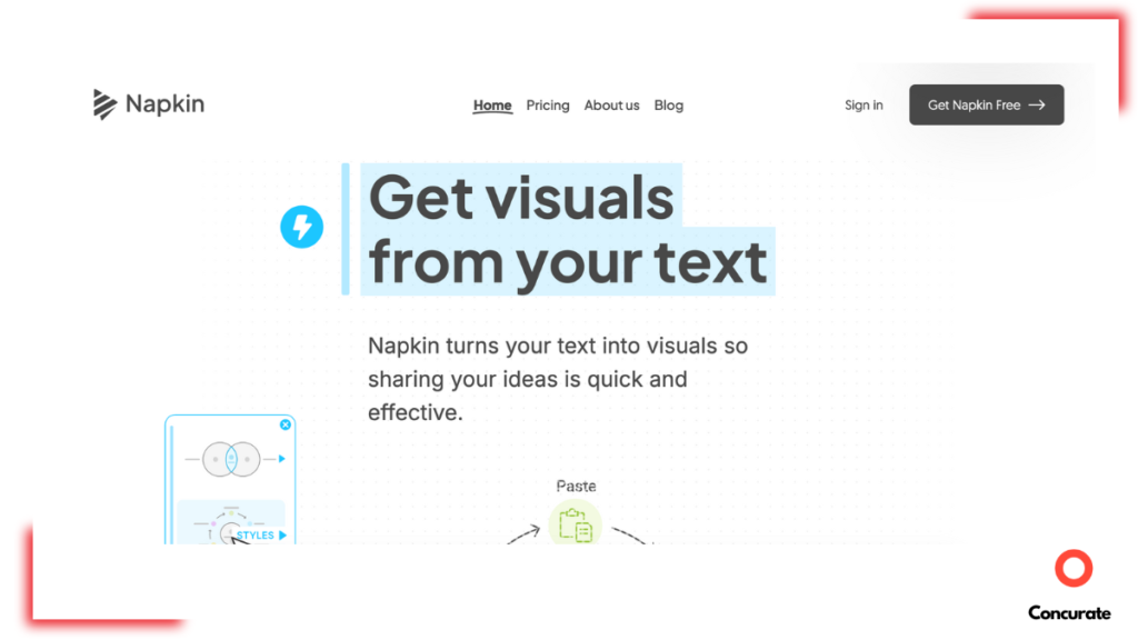
Source: Napkin AI
Instead, I’m walking you through the features I personally used.
For each feature, I’ll tell you what it does, why it matters, and who it actually helps.
Text-to-Graphic Generation
This is the feature that made me fall in love with Napkin AI.
The workflow is so freaking simple. You just paste your content into the Napkin AI whiteboard. The tool reads it, understands the context, and generates visual options based on what you wrote.
You don’t have to tell it “make this a flowchart” or “turn this into a bar graph.” Napkin AI figures that out on its own.
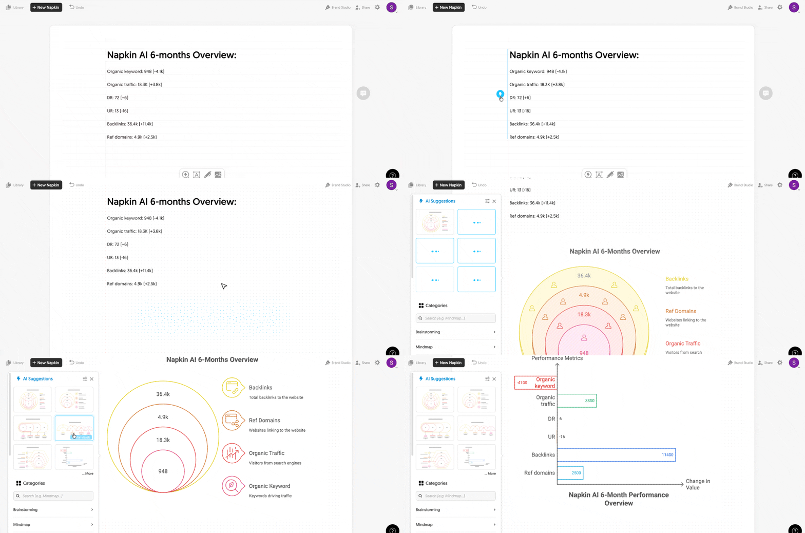
Once it generates visuals, you get multiple design suggestions. You can pick the style that fits your content best. Some are minimalist. Others are more detailed. Some use icons. Others don’t.
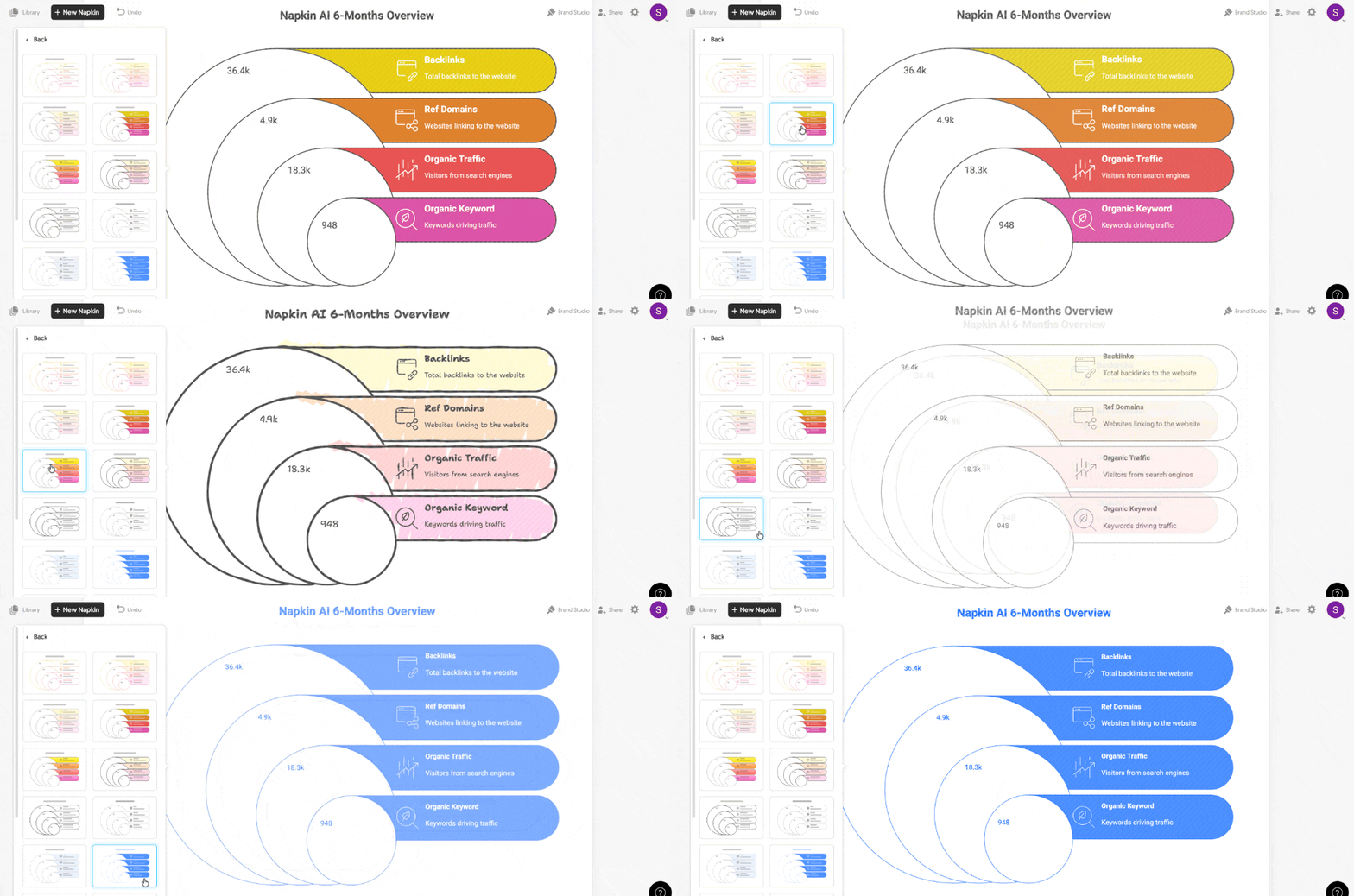
And if you don’t like the default colors or layout, you can edit everything inside Napkin AI itself. You can change text and numbers, swap colors, and adjust positioning. It’s not Figma-level control, but it’s enough to add your design instincts to the visuals.
Here’s the part that matters most.
What used to take me around 20 minutes now takes under 10 seconds.
This is not an exaggeration. I timed it (literally). From pasting text to exporting a finished graphic, the entire process takes less than 10 seconds if you don’t need heavy edits.
20 minutes to 10 seconds. That’s a 99.17% time reduction. Or if you want to think about it differently, that’s an ~11,900% increase in productivity. This alone changed how often I add visuals to my articles.
Before Napkin AI, I’d skip visuals because they took too long. Now I add them without thinking twice.
AI Drafting + Visuals Workflow
This feature surprised me because I didn’t expect it to be as useful as it was.
Napkin AI doesn’t just convert existing text into visuals. It can also help you draft content from scratch and then turn parts of that content into graphics.
Here’s how it works.
You create a new napkin inside the tool and go to “Draft with AI.” You give Napkin AI a prompt to draft content for you.
Here, I gave the prompt “3 Best Practices for HIIT Workout.” Napkin generated the text based on my prompt. And once you have that draft, you can highlight specific sections and convert them directly into visuals.
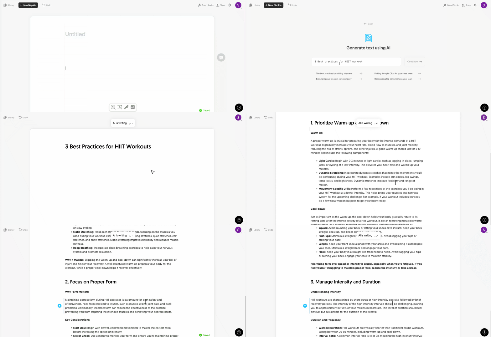
This workflow is especially helpful when you’re brainstorming or outlining something and realize midway that a part of it would work better as a diagram.
Instead of switching between a writing tool and a design tool, you stay in Napkin AI.
I used this feature less than the text-to-graphic one, but when I needed to quickly map out a process or framework from scratch, it saved me from opening three different tabs.
This workflow makes Napkin AI useful not just as an infographic maker, but as an AI tool for creating visuals directly from ideas and prompts.
New Visual Generation Experience (Categories + Search)
Since I use Napkin AI a lot, I’m subscribed to their newsletter. A few months back, I got an email about a new feature they were rolling out called the Visual Generation Experience.
I had to try it.
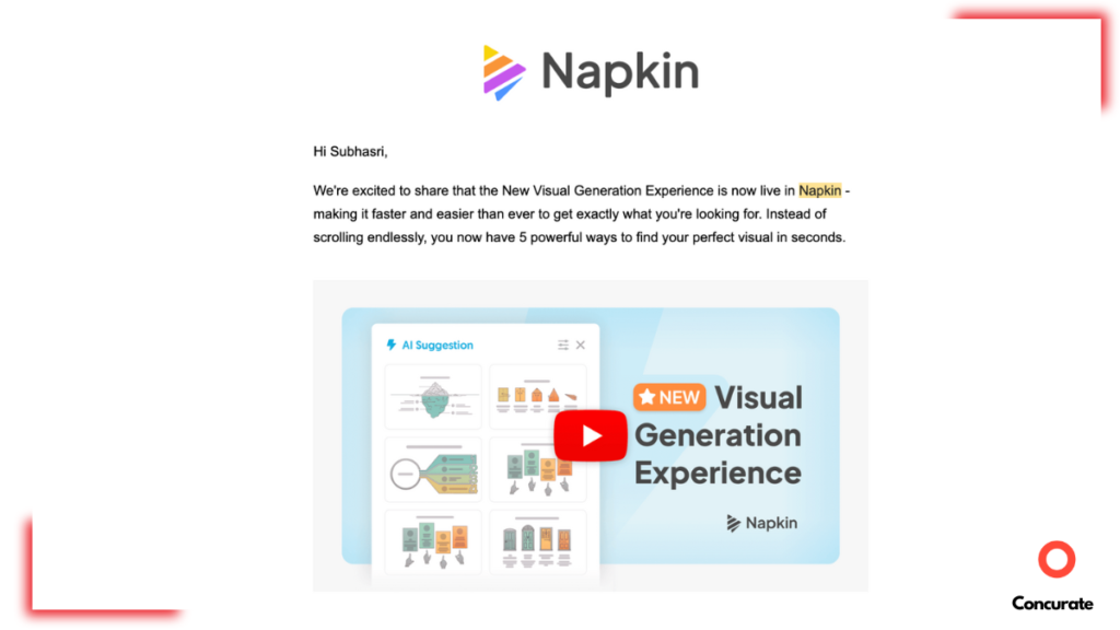
Before this update, you’d paste text, and Napkin would suggest visuals based on what it thought fit best. Now, you get more control without losing speed.
Here’s what changed.
When you select content to convert into a graphic, Napkin AI now shows you category-based visuals. You can pick the exact type of visual you want to create:
- Mind maps for brainstorming and idea mapping.
- Processes for step-by-step workflows.
- Frameworks for structured concepts.
- Comparisons for side-by-side evaluations.
- Timelines for chronological events.
- Cause and effect for showing relationships.
Plus more categories like hierarchy, visual metaphors, narratives, and part-of-a-whole diagrams.
If you already know what kind of visual you need, there’s now a search bar. You can type “flowchart,” “timeline,” or “comparison chart,” and Napkin AI pulls up relevant design options immediately.
And if you’ve used a specific visual style before and want to reuse it, Napkin lets you access your recent visuals so you don’t have to start from scratch every time.
This update made the tool feel less like “AI decides for you” and more like “AI gives you smart options, you pick what works for you.”
For someone like me who is finicky about graphics and designs, having these categories and options (i.e. flexibility) saved me from scrolling through irrelevant suggestions and made the process more exciting.
Export and Library Management
Once you’ve created your visual, getting it out of Napkin AI is just as simple as making it.
Click export, and you get options. A lot of them.
Export formats: You can download your graphic as PNG, SVG, PDF, or even PowerPoint (PPT), which makes Napkin AI practical for blog visuals, presentations, and AI-generated infographics across platforms.
Resolution options: Napkin AI lets you choose between 1x, 2x, and 3x resolution. If you need high-quality visuals for print or large screens, the 3x option works well.
Light or dark mode: You can export your graphic in light mode or dark mode depending on where you’re using it.
Background toggle: Want a transparent background? Turn it off. Want a solid background? Keep it on.
Watermark removal: The free version adds a small Napkin AI logo to your exports. If you want to remove it, you need the paid plan.
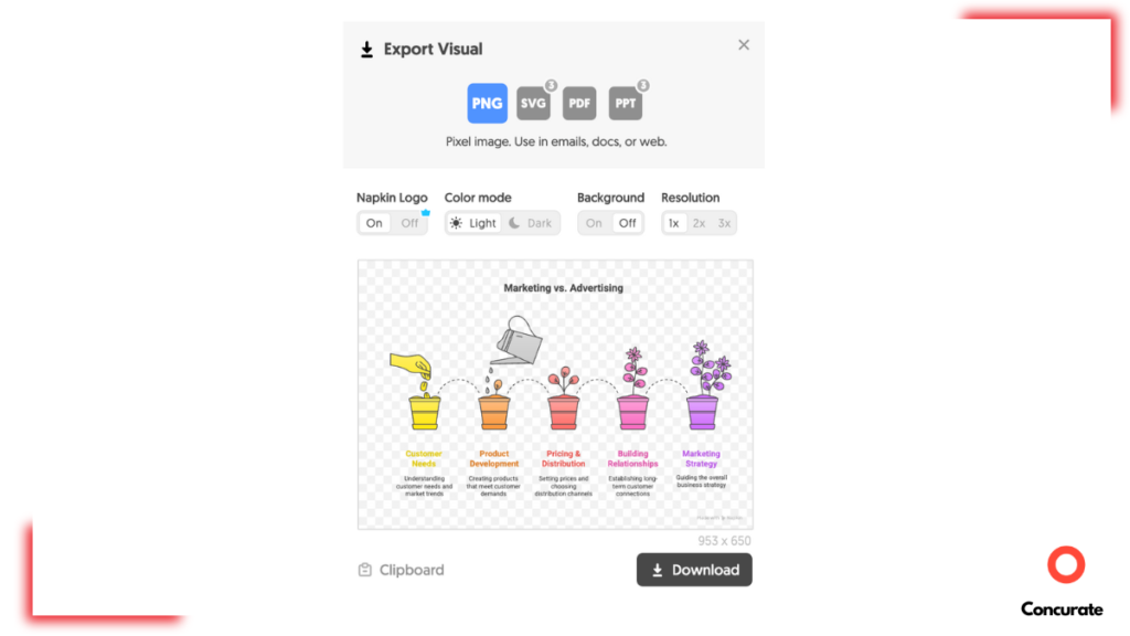
All of these options are available in one export window. There are no hidden menus or multi-step process. You pick what you need and download.
On the left side of the interface, there’s a library where you can navigate all your projects and designs. Every visual you create gets saved there automatically, so you’re not hunting through folders or losing work.
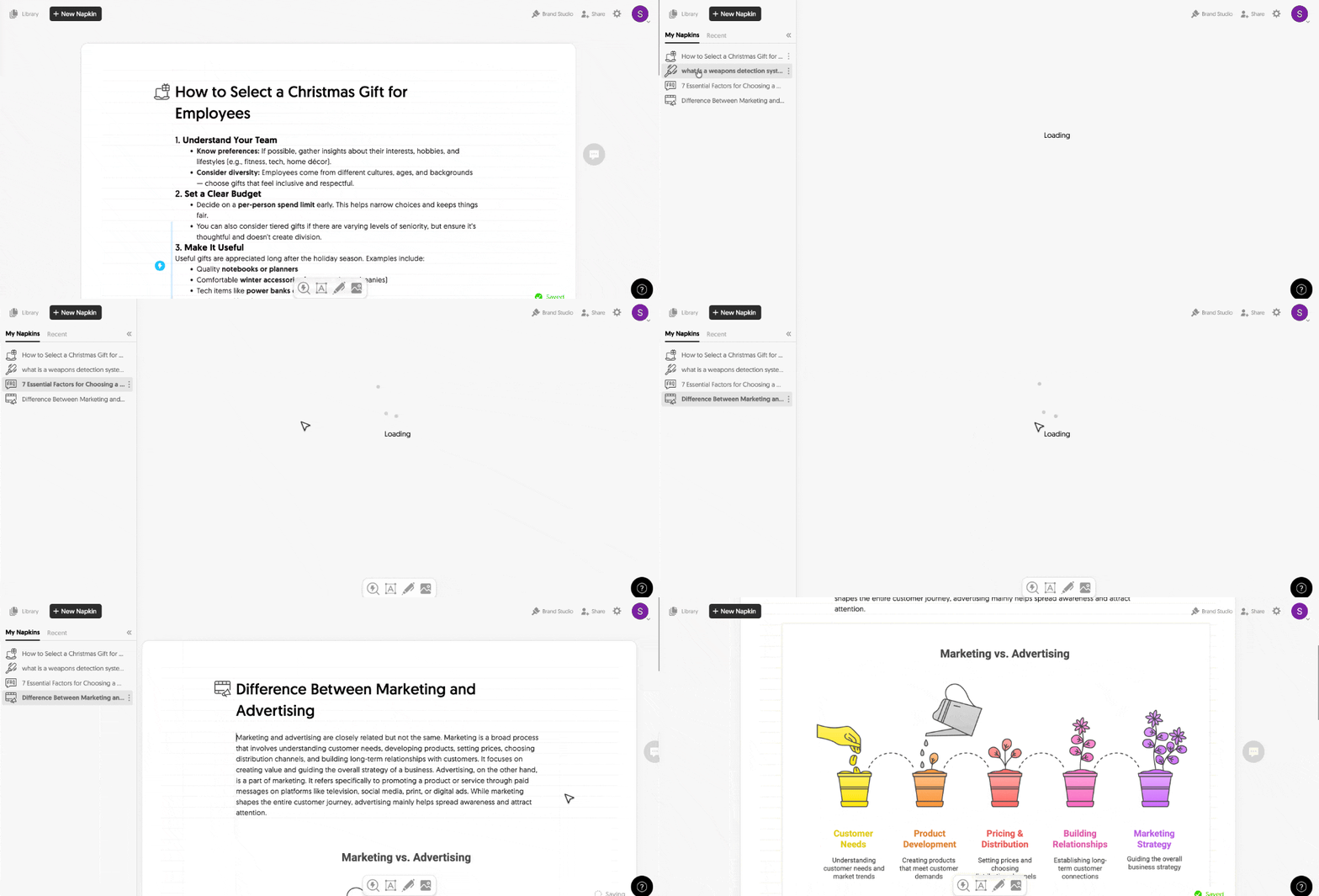
For someone juggling multiple client projects or creating visuals for different campaigns, this library system keeps everything organized without extra effort.
What Frustrated Me About Napkin AI (Real Limitations)
Napkin AI is good. But it’s not perfect. And if I’m being honest, there are two things that consistently annoyed me while using it.
These aren’t small nitpicks. They’re friction points that slow down my design workflow. And if you’re someone who works with clients or has strict brand guidelines, these limitations will frustrate you too.
But first, we have compiled a 13-point checklist to optimise blogs for AI searches. Download the checklist for FREE below.
Missing Brand Color Control
You cannot save a brand color palette in Napkin AI. Every time you create a new visual, you have to manually pick colors again. If you’re working on client projects where brand consistency matters, this becomes exhausting fast.
For personal projects or one-off designs? I can live with it. But it becomes really frustration when I am trying to create a series of graphics that must abide by a set of brand colors.
This feels like a basic feature that should exist but doesn’t.
Resizing Graphics Is Clunky
Here’s another pain point. Sometimes I need to make a graphic smaller. Maybe it’s too large for a blog layout. Maybe I need a compact version for social media. Napkin AI makes this difficult.
There’s no simple “resize” option that lets you shrink or expand the canvas cleanly. You can zoom in and out while editing, but that doesn’t let you change the size that effortlessly, as you can see below.
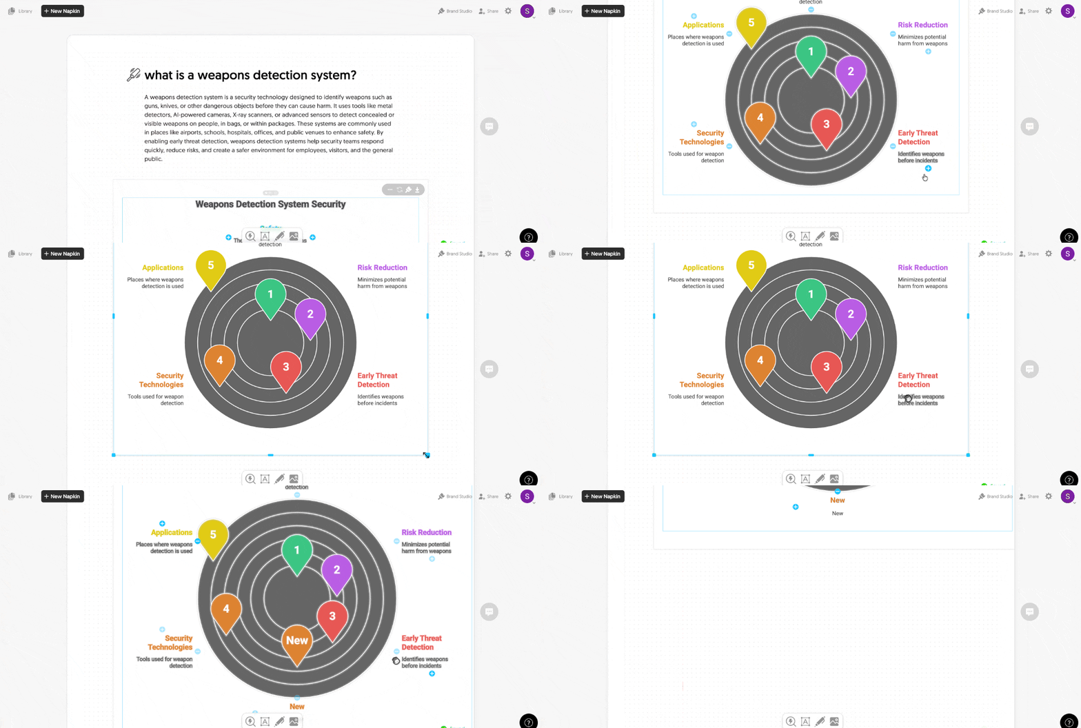
I tried dragging elements. I tried adjusting manually. Nothing gave me clean control over final dimensions. I didn’t find a workaround. Maybe I missed something, but if resizing isn’t obvious, that’s a UX problem.
However, I still use Napkin AI. These frustrations will never stop me from recommending it. But they do slow me down. And if you’re evaluating whether to pay for this tool, you need to know these limitations exist. Maybe these limitations are not their in the paid versions. I can only tell about it when I finally buy the subscription for Napkin AI.
What You Actually Get in Napkin AI Free vs Paid Version
The free version of Napkin AI is genuinely useful. That’s the reason why I was never really interested in subscribing for the premium version.
But there are limits obviously. And depending on how much you use the tool, those limits will either be fine or frustrating.
Here’s what actually changes when you pay.
What the Free Plan Gives You
The free plan gives you full access to the core editor. You can create visuals, edit them, and export them. But there are caps. You get around 500 AI credits per week. Roughly 1 word = 1 credit. So if you’re pasting a 300-word section to turn into a graphic, that’s 300 credits.
For someone creating one or two visuals per week, this is fine. For someone creating five or six visuals per article multiple times a week, you’ll hit the limit fast.
Every export comes with a Napkin AI watermark. Not huge, but noticeable. If you’re creating client-facing work or branded content, that watermark matters.
What Paid Plans Add
If you’re comparing AI infographic generators based on pricing and output flexibility, these differences matter more than feature lists.
Paid plans come in two main tiers: Plus (around $9–12 per person/month) and Pro (around $22–30 per person/month).
Here’s what you actually get when you upgrade.
Free vs Paid Comparison
| Aspect | Free Plan | Plus Plan | Pro Plan |
| Price | $0/month | ~$9–12/month | ~$22–30/month |
| AI Credits | ~500/week | ~10,000/month | ~30,000/month |
| Visual Generation | Limited by weekly credit cap. | Effectively unlimited for most users. | Effectively unlimited. |
| Export Formats | PNG, PDF (with watermark). | PNG, PDF, PPT, SVG (no watermark). | PNG, PDF, PPT, SVG (no watermark). |
| Branding and Styles | Basic styles, limited colors. | 3 custom styles, brand kits. | Unlimited custom styles, custom fonts. |
Which Plan Should You Pick?
Stick with Free if:
- You’re testing Napkin AI or using it occasionally.
- You create 1–2 visuals per week.
- You’re okay with watermarks on exports.
- You don’t need PowerPoint or SVG formats.
Upgrade to Plus if:
- You create visuals regularly for content or presentations.
- You want clean exports without branding.
- You need PPT and SVG formats.
- You’re working with clients and need basic brand control.
Go Pro if:
- You create high volumes of visuals (5+ per week consistently).
- You need strong brand control (custom fonts, unlimited styles).
- You’re working with multiple clients or managing a team.
- You need collaboration features and higher credit limits.
My 2 Cents:
I survived 8 months on the free plan because my usage was sporadic. Some weeks I’d create five graphics. Other weeks, none. But if you’re a content marketer creating visuals for every article, or a consultant building client decks regularly, the free plan will feel restrictive fast.
The watermark alone is reason enough to upgrade if you’re doing client work. And the jump from 500 credits/week to 10,000 credits/month makes the Plus plan worth it for regular users.
If you’re serious about using Napkin AI as a core tool in your workflow, plan to pay. The free version is great for testing, but paid is where the tool becomes truly useful.
A Quick Overview of Napkin AI’s Pros and Cons
After 8 months of using Napkin AI, here’s what actually works and what doesn’t.
Napkin AI Pros:
- Lightning-fast visual creation: You can converts text into visuals in seconds.
- Extremely beginner-friendly: You don’t need design skills. Non-designers can create professional-looking diagrams, flowcharts, and frameworks without learning Figma or spending hours in PowerPoint.
- Strong variety of visual types: Mind maps. Processes. Frameworks. Comparisons. Timelines. Cause and effect. Napkin AI handles business storytelling visuals really well.
- Excellent export options: Paid tiers let you export as PNG, PDF, PPT, and SVG. This makes it easy to drop visuals into blog posts, slide decks, Notion docs, or client deliverables without reformatting.
- Branding support on paid plans: Paid plans offer brand kits, custom styles, and the ability to upload custom fonts. If you’re working with clients or maintaining brand consistency across a team, this helps.
Napkin AI Cons:
- Limited brand customization: You can’t save brand color palettes. Every time you create a new visual, you manually pick colors again. For client work or branded content, this becomes friction.
- Not for complex diagrams or collaboration: Napkin AI is built for speed, not precision. If you need pixel-perfect design, detailed technical schematics, or deep collaborative workflows, traditional tools like Figma or Lucidchart are still better.
- Free plan is restrictive: The free version caps you at around 500 AI credits per week. If you’re creating visuals regularly, you’ll hit that limit quickly. The watermark on exports also makes the free plan less useful for professional work.
- Occasional structural errors: The AI doesn’t always interpret complex frameworks or hierarchies correctly. Sometimes you’ll need to regenerate visuals multiple times or manually fix relationships between elements.
- Pricing still evolving: Napkin AI’s credit limits, project caps, and tier features have shifted as the tool iterates its pricing model. This makes it harder to predict long-term costs if you’re planning team budgets.
- Not a data visualization or BI tool: Napkin AI is great for illustrative charts and business diagrams. But it’s not built for live data dashboards or serious analytics work. If you need interactive metrics or data-connected visuals, you’re looking at the wrong tool.
Best-Fit Use Cases
Napkin AI works best for:
- Content marketing visuals (blog diagrams, infographics).
- Strategy decks and one-pagers.
- Training materials and explainer diagrams.
- Client-facing visuals where speed and clarity matter more than pixel-perfect design.
Napkin AI is not the right fit for:
- Highly branded campaigns requiring art-direction-level control.
- Complex technical schematics or engineering diagrams.
- Live data visualization or BI dashboards.
- Collaborative design workflows across large teams.
If your priority is getting good visuals fast without learning design tools, Napkin AI is one of the best options available. If you need precision, deep customization, or data-heavy work, stick with traditional design or BI tools.
Napkin AI vs Other AI Infographic and Diagram Generators (Miro AI, Venngage AI)
If you’re reading this Napkin AI review, chances are you’re evaluating Napkin AI and you’ve also come across tools like Miro AI Diagram Generator and Venngage AI Infographic Generator.
All three tools fall under the broader category of AI visualization tools, but they solve very different problems. Napkin AI focuses on fast text-to-visual generation, Miro AI emphasizes collaborative diagramming, and Venngage AI prioritizes branded infographic creation.
Once you understand that, the comparison (and decision) becomes much simpler.
Comparison Table: Napkin AI vs Miro AI vs Venngage AI
| Feature | Napkin AI | Miro AI | Venngage AI |
| Pricing position | Mid-range SaaS with individual and team plans. Best suited for professionals and small teams creating visuals frequently. | AI layered on top of standard Miro plans. Makes sense if your team already lives inside Miro boards. | Tiered plans for individuals, business, and enterprise. Can get pricey with multiple brand kits or seats. |
| Ease of use | Extremely simple. | Easy for basic diagrams, but full value comes after learning boards, canvases, and collaboration flows. | Template-driven and beginner-friendly, but heavier due to branding and layout options. |
| Best for | Content marketers, consultants, analysts, and educators creating visuals for blogs, decks, and reports. | Product, UX, and strategy teams running workshops, mapping processes, and collaborating live. | Marketing and comms teams producing polished, branded infographics and reports. |
| Key limitations | Not ideal for deep collaboration or very complex technical/system diagrams. Customization is lighter than full design tools. | Overkill for quick, one-off visuals. Best value is team-based, not solo use. | Strong for infographics, weaker for general-purpose diagramming or whiteboarding. |
Which Tool Should You Pick?
This really comes down to how you work, not which tool has more features.
- Choose Napkin AI if you’re a solo creator, marketer, consultant, or analyst who mainly needs to turn text briefs, outlines, and insights into clean diagrams and infographics quickly. It’s built for speed and clarity, not workshops.
- Choose Miro AI if your core workflow revolves around collaboration. If you run strategy sessions, product workshops, or mapping exercises with teams, Miro makes more sense. The AI diagrams are just one part of a bigger collaborative environment.
- Choose Venngage if your priority is visually rich, branded infographics and reports. If you’re producing external-facing content for campaigns, social, or stakeholders and care deeply about brand polish, Venngage is the better fit.
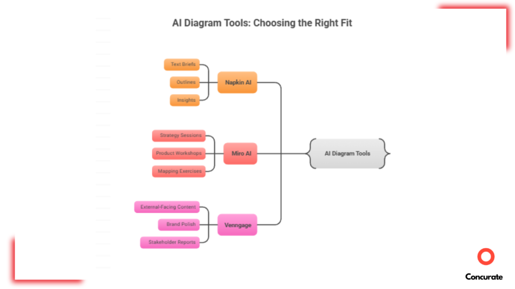
None of these tools are objectively “better.” They’re designed and optimized for different use cases. Once you’re clear about your job-to-be-done, the choice becomes obvious.
My Final Verdict: Should You Use (and Buy) Napkin AI?
After using Napkin AI for sooo long, I honestly believe it saves time. A lot of it. What used to take me around 20 minutes per visual now takes under 10 seconds. And this is not marketing Mathematics. This is actual numbers. That’s me timing it during real content work.
Napkin AI removes the biggest friction in content creation. That alone makes it worth considering.
My recommendation will be:
If your work involves creating content, explaining concepts, or presenting ideas visually, Napkin AI is absolutely worth paying for.
It’s especially valuable for:
- Content marketers and SEO writers.
- Consultants and analysts.
- Educators and course creators.
If visuals are a regular part of your workflow, the paid plans make sense. The free version is great for testing, but once you start hitting credit limits or need clean exports, upgrading seems like the next obvious step.
The Tradeoffs You Should Know:
Napkin AI is not a professional design tool. This is definitely not something that my actual designer friends use. You won’t get pixel-perfect control, deep brand customization, or complex collaboration features.
If your job requires art-direction-level design, detailed technical diagrams, and live collaboration with large teams, this isn’t the right tool. And that’s okay.
Napkin AI is built for speed, clarity, and momentum, not perfection.
My Final Takeaway:
Choose Napkin AI if you’re creating content regularly and need to quickly turn text into clear visuals without spending hours in design tools.
Design Helps. But Content Still Does the Heavy Lifting.
After reading this honest-to-God Napkin AI review, you’re sorted on the design front. You know how to create visuals faster, which tool to pick depending on your use case, and how to stop design from slowing you down.
But here’s the uncomfortable truth. Even the best visuals won’t save bad content.
A beautifully designed article that doesn’t solve a real problem, doesn’t target the right intent, or doesn’t move readers toward a decision is still useless. It won’t rank. It won’t convert. And it definitely won’t generate revenue.
That’s where most SaaS content falls apart. And that’s exactly where Concurate comes into the picture and flips the script.
We help B2B SaaS businesses turn content into revenue outcomes. Real sign-ups, demo requests, and free trials.
We helped a patent management SaaS generate 500+ sign-ups purely through content. Just content built around real search intent and buying behavior. You can read the full story here: B2B SaaS Content Marketing Case Study.
Claim your free consultation call with Concurate, and let’s turn your SaaS content into your next growth story.
FAQs About Napkin AI Review
I’ve covered a lot of ideas in this Napkin AI review. Still, there are a few questions that keep coming up whenever people talk about Napkin AI. Below, I’ve answered the most common ones I hear. And if your question isn’t here, you can always reach out to us.
How Accurate is Napkin AI When Handling Highly Technical, Niche, or Domain-Specific Content?
Napkin AI does a fairly decent job with structured or technical content like step-by-step processes, basic system flows, or clearly defined frameworks. If the logic is straightforward, the visuals usually make sense and are accurate.
It could sometimes struggle with highly niche or abstract topics. It could be things like advanced medical concepts, deep engineering systems, or very domain-specific terminology often need manual correction.
Napkin AI relies on predefined visual patterns, so it can miss nuance. In those cases, you’ll have to spend time fixing relationships or labels rather than getting a perfect output on the first try.
Does Napkin AI Retain or Reuse Your Uploaded Text and Visuals for Model Training or Internal Purposes?
Napkin AI allows users to opt out of having their content used for model training through account or team settings. If that option is enabled, your uploaded text and visuals are not reused beyond generating your outputs.
That said, if you’re working with sensitive or regulated data, it’s always smart to double-check the latest privacy and data usage terms before uploading anything confidential.
How Does Napkin AI Perform with Long-Form Content or Very Large Documents (e.g., 2,000+ Words)?
Napkin AI isn’t built to handle massive documents in one go. Feeding it 2,000+ words at once will burn through credits quickly and can make outputs messy or harder to navigate.
In practice, it works much better when you break long content into sections and generate visuals piece by piece. That approach gives you more control and better results. For complex narratives or layered ideas, you’ll still need to guide the structure and make manual edits.
What Happens if Napkin AI Misinterprets Context? Is There a Way to “Lock” o “Fix” Meaning Before Regenerating Visuals?
Yes. If Napkin AI misreads context, you’re not stuck starting from scratch.
You can lock specific text blocks so the wording doesn’t change when you regenerate visuals. You can also edit the text after a visual is created, and the graphic updates accordingly. This makes it easier to correct misunderstandings without losing the entire layout.
Napkin AI is surely not perfect, but it gives you enough control to fix issues without fighting the tool.
How Reliable is Napkin AI for Maintaining Visual Consistency Across a Large Content Library?
Napkin AI is fairly reliable when it comes to visual consistency, especially if you reuse styles and templates. You can create custom styles and apply them across visuals, which helps maintain a consistent look.
That said, if you rely too heavily on the same templates, visuals can start to feel repetitive over time. It’s consistent, but not endlessly flexible.
For most content libraries, it’s good enough. For highly differentiated brand storytelling, you may still want occasional custom design work.
Does Napkin AI Integrate with Common Content Workflows (CMSs, Notion, Google Docs, etc.) or Is It Fully Standalone?
Napkin AI is mostly a standalone tool. There are no native integrations with CMSs, Notion, or Google Docs. You create visuals inside Napkin AI and export them into your workflow. You can connect it indirectly using automation tools like Zapier, but that adds extra steps.
If seamless in-doc visual generation is critical for you, this may feel limiting. If you’re okay with exporting visuals and dropping them into your content manually, it’s fairly manageable.
How Well Do Napkin AI–Generated Visuals Actually Perform in Terms of SEO, Engagement, or Conversions?
This isn’t really about Napkin AI specifically. It’s about visuals in general.
Any custom visual you create, whether it’s made using Napkin AI, Canva, Figma, or even PowerPoint, is going to perform better than generic stock images. Because custom visuals are contextual. They’re directly tied to the content. They help readers understand ideas faster and more clearly. And anything that’s easier to understand sticks longer. That’s what improves engagement.
From an SEO and conversion perspective, visuals help when they support the content. They can reduce bounce rates, increase time on page, and make complex ideas easier to digest. But they are not a shortcut.
However, adding visuals will not magically fix bad content.
At the end of the day, good-quality content is still the foundation. If the content itself is weak, no amount of diagrams or graphics will make it rank or convert. Visuals amplify good content. They don’t replace it.
What Are the Collaboration Limitations in Real-World Team Environments?
Napkin AI supports basic collaboration features like commenting and version history, which works fine for small teams. Where it falls short is in structured approval workflows or granular permissions. There’s no formal review or approval system, and admin actions like removing a team member can immediately revoke access.
Is Napkin AI Viable as a Long-Term Core Tool?
At this stage of development, Napkin AI works well as a core tool for individuals and small teams, but credit-based pricing does introduce some risk at scale. Heavy usage can drain credits faster than expected, especially with long-form content. If you hit limits, workflows can get disrupted until credits reset or you upgrade.
What Happens if Napkin AI Shuts Down, Changes Pricing Significantly, or Removes Features You Rely On?
You retain ownership of everything you create in Napkin AI. Even if you cancel your subscription, you can still export your visuals.
If features change or pricing shifts, access depends on your plan at that time. There are no explicit protections against major pricing changes or feature removals, so the safest approach is to regularly export important visuals and not rely on the tool as your only storage layer.
That’s true for most SaaS tools, and Napkin AI is no exception.
Is Napkin AI the Best AI Infographic Generator for Content Marketing?
Napkin AI is one of the best AI infographic generators for content marketing teams that prioritize speed and clarity over advanced design control. It works especially well for blogs, reports, and educational content where visuals support written explanations.
If you want such valuable insights delivered to your inbox every Friday, subscribe to your newsletter below. Maybe in one email you will learn about some cool new features of Napkin AI!
Is Napkin AI an AI Infographic and Diagram Generator?
Yes. Napkin AI fits squarely into the category of AI infographic generators and text-to-diagram AI tools. Its core functionality revolves around converting written content into AI-generated visuals, including flowcharts, frameworks, timelines, comparisons, and structured diagrams.
Unlike traditional design tools, Napkin AI works as a text-to-visual AI system. You paste text, and the tool automatically interprets structure, hierarchy, and relationships to generate diagrams and infographics. This makes it particularly useful for people searching for AI diagram generators from text, AI visuals generators, or AI tools for creating infographics without design skills.
If you’re evaluating tools in the broader AI visualization category, Napkin AI sits between lightweight infographic makers and heavier diagramming platforms. It prioritizes speed, clarity, and usability over pixel-perfect customization.
What Other SaaS Review Should I Read?
Here are a couple of interesting SaaS reviews that you might want to read before making a purchase:
If you want more insightful SaaS reviews delivered to your inbox every Friday, consider signing up for our free newsletter.
Disclaimer: The information provided in this Napkin AI review is based on personal experience as well as publicly available sources and is intended for general informational and guidance purposes only. It should not be relied upon as a final decision-making resource or as a substitute for professional advice. While we strive for accuracy and completeness, we make no representations or warranties regarding the correctness, reliability, or suitability of the content. If you believe any information should be updated, corrected, or removed, please contact our team for review.


