Your website can reach the largest audience. Make it your best 24X7 salesperson – it sells on your behalf even when you are asleep.
A good website doesn’t necessarily tell you about what product or service it’s selling. It’s about the benefits your target audience can get by using your solution. So, sell the benefit, not the product.
- Grammarly sells great writing, simplified.
- Google Workspace sells real-time collaboration and efficiency.
- Hootsuite sells time management and convenience.
Get the drift?
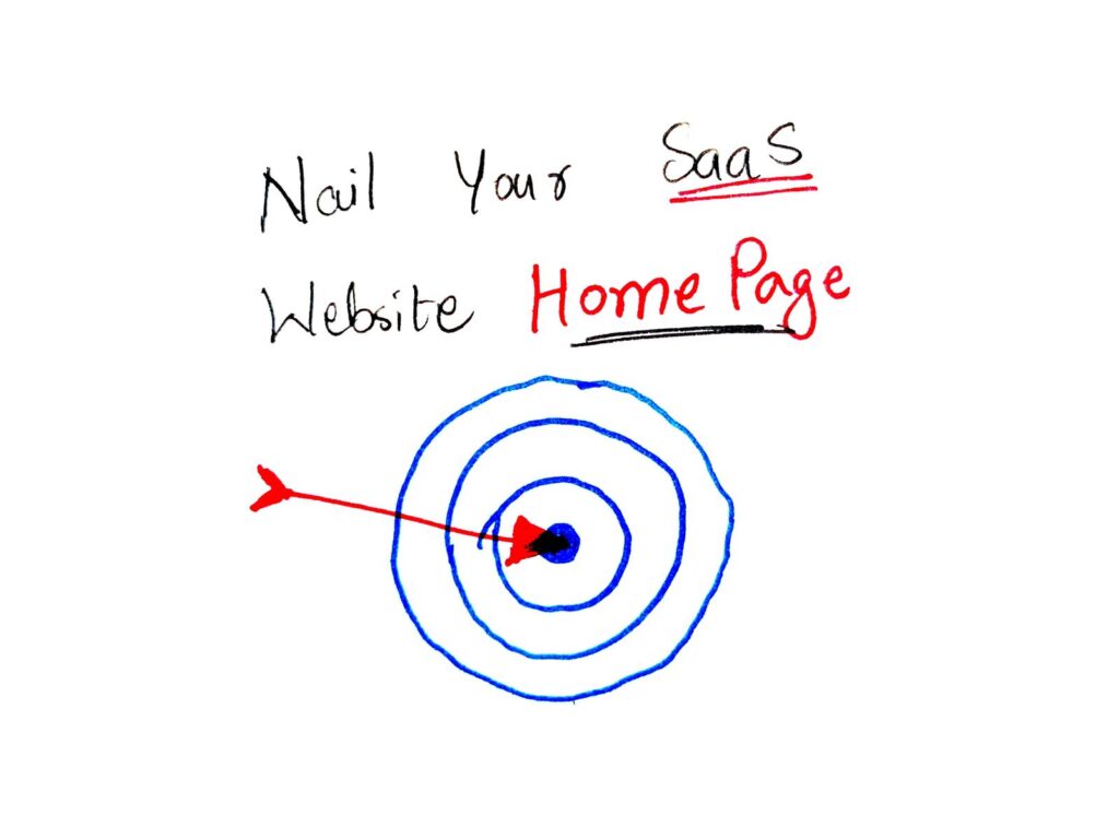
The basic rule of website development is to make the website more about your visitor (or potential customer) and less about you. Walk the customer through your home, that is your website, making them feel comfortable and wanted in that space. All of that starts with the home page.
The Home Page | Don’t let visitors have to ring the bell
50 milliseconds is all it takes for us to make up our minds. That’s all the time you have to capture your audience’s attention. The people who say that they don’t judge a book by its cover are lying. We are wired to pass judgment on first impressions. That’s just how the human mind works. Your website landing page is the cover of that book which people are silently judging. It is your chance to make the best first impression.
Here’s an overview of the various sections you must have on your home page:
Section #1 – The Headline, Sub-Headline and Call to Action
Section #2 – Challenges
Section #3 – Solutions with Features
Section #4 – Benefits
Section #5 – Answers to Objections
Section #6 – Social Proof and Testimonials
Section #7 – Plans and Pricing
Section #8 – Visitor Details Capture
Pro tip: If you need 30 standout SaaS growth hacks to attain double the growth for your SaaS business, fill out the form below!
Section #1: Your Headline, Sub-Headline and Call To Action (must be designed to hook)
This is where you hook your customers or lose them. Using the right words to act as bait is a science. While there are different approaches to a great headline, there are some tips and tricks that can help you hook more, and lose less.
#1 Headline – Identify the problem to form a connection with your visitor
You are using your website to sell solutions to people’s problems through your product. The purpose of your product is to alleviate pain points. Your headline must identify this pain point, ideally in under 10 words.

# 2 Use a sub headline to show your product has a solution
If your headline states the problem, use a subtitle or sub-headline to highlight the solution. The purpose of the sub headline is to let users know how your product can help solve their problem, and what it can help them do. Subheadline could be longer than your headline. It could also be a whole sentence.

#3 Design a Call to Action button to maximize entry into your funnel
A CTA button is an invitation to the user. What you would like to invite the user to do depends on what you have to offer. So, it could be something as simple as the offer of a free trial…
Or, something that is more immediate, like using your service right there and then.

ProTip #1
Continually test so you know your audience
There are tools available (like Crazyegg) that help you assess the performance of your headline and landing page. Markets change from time to time as do customer expectations and choices. So, keep testing your headline to ensure that it continues to hook and convert.
ProTip #2
Clever is cute. But clarity increases engagement
Keep your headline as simple, straight and to the point as possible. The most impactful headlines don’t need to be witty or clever or complex. Simple is good. Simple sells.

The user is not always interested to know how good you are. What concerns them is only if you can solve their problem. So, make it personal. Put the user first.
Section #2: List out challenges (to show the user that you understand what they’re looking for)
By listing challenges that the user may face that drives the user to looking for a product like yours, you establish relatability with the user. This section can make the user feel like you “get them.” Many a time, a user may not even be aware of the challenges he is faced with. But if you can list out challenges that are a little out of the ordinary, these may just echo with the pain points a user didn’t know how to articulate. And seeing that you understand the user persona as well as you portray, this will intrigue the user to explore more of what your product has to offer.
Section #3: Introduce solutions with benefits (to make them feel like they can’t do without your product)
The solution section is the part of your website that gives you the opportunity to showcase how good your product really is. Here, write about EVERYTHING that your product is capable of doing, all the ways in which it can add value to the life of the user. Instead of simply listing the features your product has to offer, show a bigger picture of how your offering can solve their pain-points.
A user is driven to your website to understand why should (s)he use your product. The user already knows what (s)he wants but will still visit the website to see how efficiently his concerns can be addressed. TriangleIP does a great job of listing the solutions to all of the possible challenges and concerns a user may face. What they also do is back each solution they provide with the feature of the product.

Listing out benefits that are not particularly feature-driven but value-driven is the perfect way to approach this. For example:
- Is it a time-saver?
- Can it help your user achieve results quicker?
- Is it easily integratable?
- Can the user use it across multiple devices?
Tell the reader everything you possibly can about what your product can deliver, and how.

Head to Google Workspace to see more!
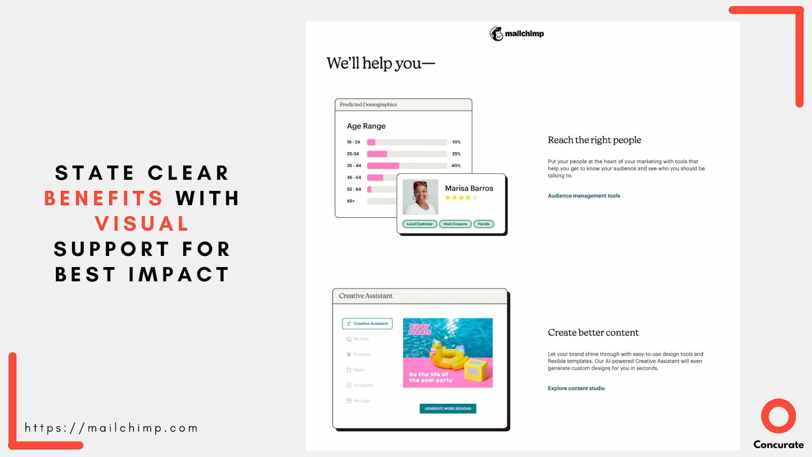
Section #4: List all the Benefits of your Product (to showcase its true potential)
We think MailChimp has done an absolutely brilliant job of laying out its benefits.

Section #5: Proactively Handle Objections (to bring the visitor closer to exploring your offering)
Use this section to give a feeling of anticipating and answering your users questions. When reading about the solutions your product offers, the visitor would try to imagine his use case. While pondering over the use cases that suit him, various objections are likely to arise in his mind. For instance:
- Will this product fit into my use case?
- Will I be able to integrate it with my existing software and tools?
- Will my team need special training to use the product?

BaseCamp lists all the third party tools it works with categorised under various heads listing the wide variety of use cases and addressing possible objections that new users might have.
Section #6: Use Social Proof and Testimonials (to show that you walk the talk)
Word of mouth drives sales. It’s the oldest trick in the marketing book and the most effective too. Social proof on your website is the next best thing. When potential customers see other people using and benefiting from your services, it makes them that much more likely to want to use it too.

If you can get happy customers to leave you testimonials, it’s a big bonus because it helps accord authenticity to your claims. Figuring out how you can portray your social proof in a manner that is easily digestible and attractive, is a bonus.

Section #7: Clearly state your plans and pricing (to increase buying possibility)
If your site visitor has reached this section, congratulations! You’ve done a great job of having them enter your customer funnel. By stating the services you offer along with the prices and plans you offer them at, you may be expediting buying decisions. Don’t be afraid to put all of the options available to the user out there. But remember to keep it clear.

Section #8: Capture the visitor’s email address (so you can nourish)
Not every visitor will be a guaranteed customer. There will always be some who are looking around to compare and analyze to find a product that is the best fit for them. This section is your chance to collect data from those warm leads so you can turn them into customers. One way of doing this is sharing a resource. It could be a free trial of your product, an e-book, a case study or a free pass to your next webinar. Another way is to offer a free demo that the visitor can book with you for your product.
Additionally, here’s a checklist of pointers that you must keep in mind –
- Use easily 🤓 readable colours. Light colours on a dark background or dark colours on a light background. Avoid shade on shade. Stick to classic contrasts.
- The image to written content ratio must be balanced ⚖️. Too much visual content will overshadow the message you’re trying to get across.
- 📝 List clearly who the site is for, more particularly, who your products and services are for. This is also where it helps if you clarify why your services are better than others. It’s not enough to just say this though. Back it up with testimonials and social proof.
- If sales are what your website is aimed at, your homepage must have a 📞 call to action button. Keep these buttons clear, preferably with the details of whether your trials are free or paid or how long it’ll take a website visitor to fill out a form.

- Don’t have unnecessary widgets or ⏪ buttons ⏩ on your homepage. It slows your website down unnecessarily, and time costs conversions.
- Your landing page should have answers to the solutions you offer, how your software Integrates with other applications 💻, reviews and testimonials and a Call to Action.
Bonus Tips:
#1 – Use SEO (to get your website to reach more of the right people)
Have your SEO keywords listed and ready to be optimized. Focus on relevance and authority. A search engine will rank your website based on how closely your content matches the searched keyword (relevance). The number of backlinks, and their quality that point back to your website is another factor that will drive up the ranking of your site (authority).

For a website to sell, the website needs to be noticeable, visible and accessible. In the web that is the internet, optimizing your SEO is something that will help with visibility.
# 2 Content is king. Here’s how to put the king to work for you.
Another way to get your website noticed is to create content on it that adds value to the reader in the resources section – blogs, case-studies, templates, guides, e-books etc.
Website content has a very specific job – to answer the questions people are asking on the internet. If done right, this is a great way to get users to want to return to your website and consume what you have to offer. How do you create that kind of content? The answer lies in well-thought out content strategy. The data points for content strategy are derived from various data points like:
- Thorough buyer persona research
- Age, gender, designation, location
- His goals, pain points, motivation
- Where does (s)he hang out on internet etc
- Competitor content strategy
- Rare insights e.g. data driven content
- Scalability
- And much more, keeping the secret sauce for our next connect 🙂
Also check: How to Create a Buyer Persona?| Buyer Persona Template
Here are some more action pointers that can help you make the most of your content:
Warm and Welcoming Tone
The general tone of your content must always be warm and welcoming. And it must be value-centric and not ego-centric. This means, make your content more about the reader and less about you.
Tell Engaging Stories
Stories are a great way to establish an emotional connection with the reader. So if you can create content that is built around telling engaging, emotional stories, you’re onto a winner.

Another way to tell a story is to use a lot of graphics and elements. Turn it into an infographic that has just the right amount of written information supported by illustrations and graphics that make content more easily digestible.

Also check: The Hero’s Journey Storytelling Framework in this post – “Decoding the Squid Game Global Phenomenon | A Virailty Tear Down”
Stay Relevant
Create and share content that is relevant to your audience. That makes them think of you when they are looking for answers to questions. Build content in your area of expertise. Create a niche and draw potential customers in.
Derive Expert Content By Guest Interviews
Bringing insights from subject matter experts is a great value addition for your users.
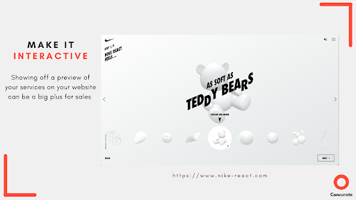
Go Out-of-the-box for Additional Engagement
Creating interactive content is a sure shot way to ensure that time is being spent on your website. Interactive content has the power to draw a visitor in because he’s curious to know what happens next. Look at how Nike aced interactive content.
Use media – images, video, audio, illustrations
A text-heavy website is not likely to get as much traction as a website that has colour, visuals, and movement. So make sure you incorporate multimedia into your website in as many ways as possible.
Share Resources to build credibility
Content shared in the form of blogs, webinars, articles, content, guides, and more makes your website more valuable for every user who chooses to spend time on it. So you must share content that makes every visitor to your site want to come back because they always leave having learnt something new.

To finish up
Making a website your best salesperson is the goal. It can give you the best RoI. Putting it together carefully and with thought is what is key. Summing up the article for you to pick up the key takeaways.
Key takeaways
- Involve your customers throughout your website. Make it about them.
- You and your customer must work as a team. And your website must reflect that
- Quantify clearly the RoI for your customer – Why and how your SAAS product is their go-to solution? Substantiate it with customer testimonials/success stories/case studies
- Make your website a place where people want to keep coming back to get actionable takeaways to level up their work
- Give people a reason to explore your SAAS product by telling what other people are saying about you.
- And last but not the least, prefer “showing” over “telling”
Hope you enjoyed reading this post! Want to learn more about email marketing?
We are sure you would love to read – “The A B C of Persuasive Marketing Emails“
If you wish to read more goodness, subscribe to our newsletter.
We send value to your inbox only once in 15 days.
If your organisation wants its content marketing strategy designed by Concurate, let’s connect over a short call. Block our calendar today! Meanwhile, Explore the plethora of resources to help you out your business!